Gboard GIF Attribution
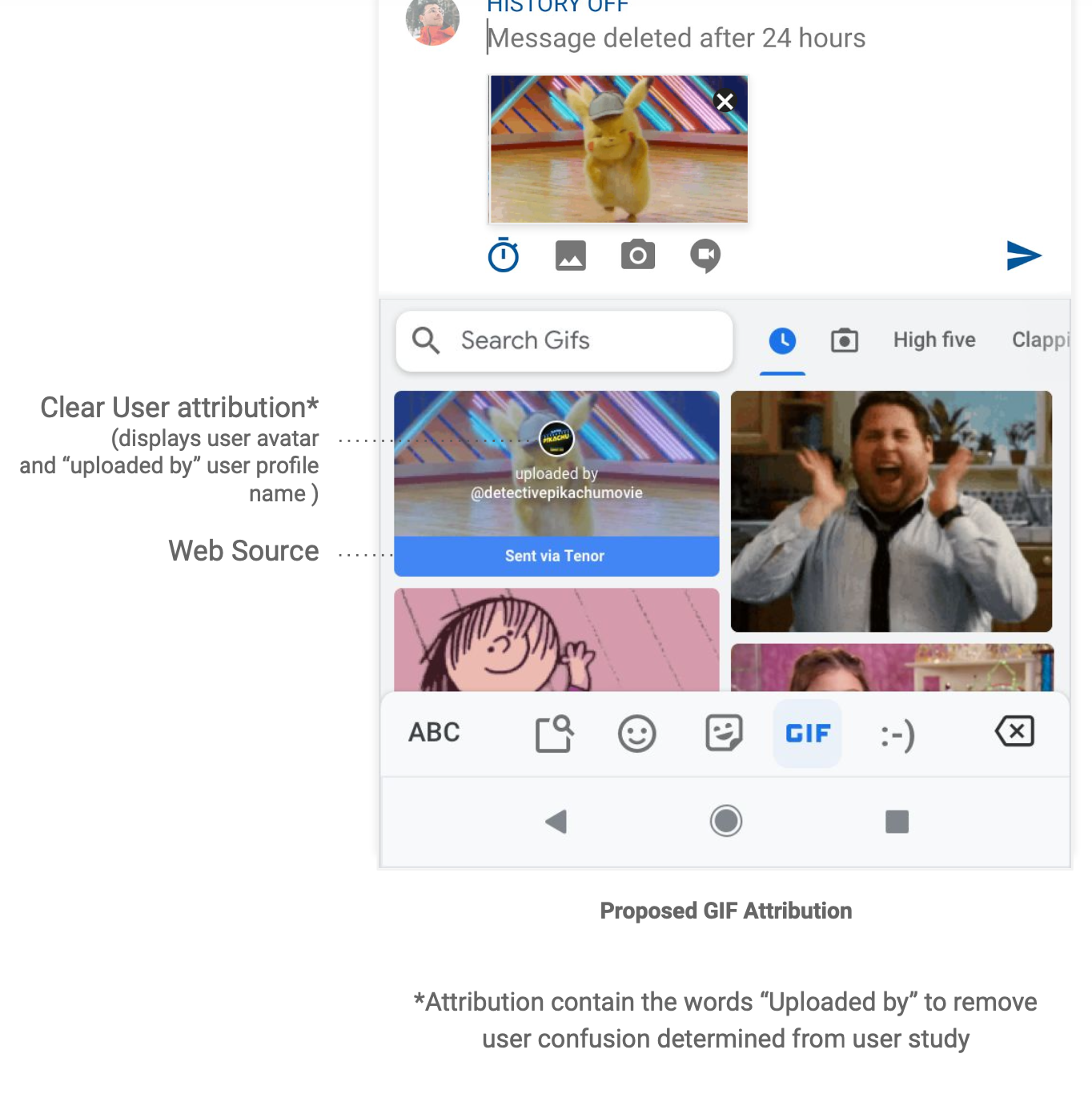
Clear attribution for shared GIF content that is User Generated on Tenor within Gboard’s UI.
Role
Led UX design and worked with PM and ENG partners to develop and test arms.
Impact
Informed Q4 roadmap
Through this process, we determined that it is not clear to users they are looking at someone’s Tenor profile.
Plans to revisit Tenor’s Profile page have now been included in our roadmap for Q4.
Problem
Educate Gboard users that GIF content they discover and share is uploaded by real users, content partners, and creators in the Tenor community.
Solution
Show clear attribution for GIF content that is User Generated within Gboard’s UI.
Background
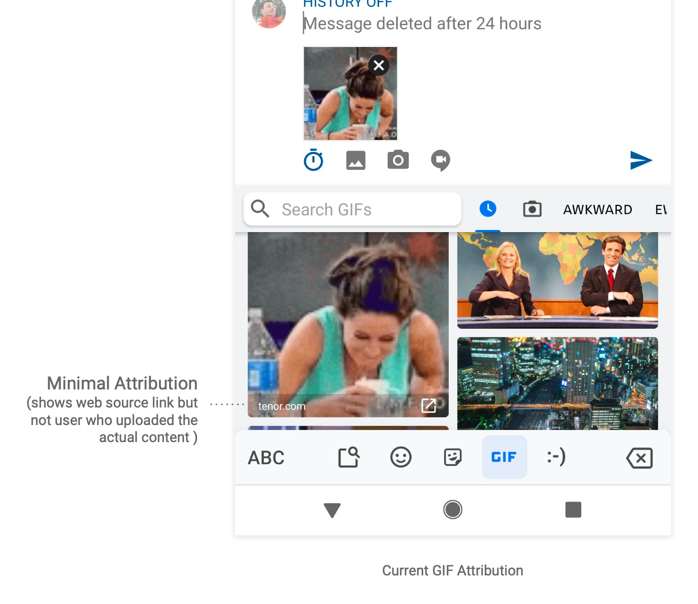
Gboard has devoted resources to providing expression features for their users with their emoji and GIF support, so it's only natural that Tenor collaborate with them, transfers knowledge, and work towards improving their expression offering in the product.
From interviews with artists and creators on the Tenor platform, we know that attribution helps with user trust and uploader retention which supports us to build a healthier content ecosystem.
The two teams aimed to encourage Gboard users to become Tenor uploaders by showing them that they too can become uploaders.
Understanding Link strategy
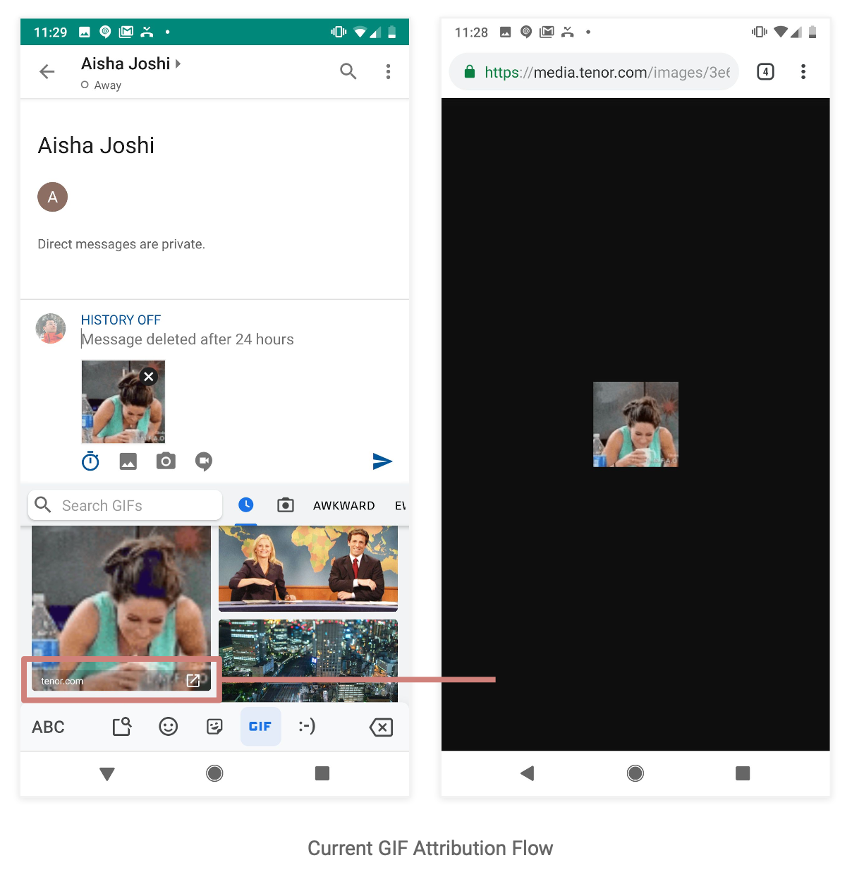
Today’s interaction flow sends users to a blank screen with the asset in the center. I wanted to explore how might we enable users to navigate through additional content.
After I brought this to my team’s attention we thought linking to Tenor’s website made the most sense given our goal. I wanted to understand if users had an understanding of this new link strategy.
I advocated for the User Journey and coordination with our internal UXR team began.
Problem
Educate Gboard users that GIF content they discover and share is uploaded by real users, content partners, and creators in the Tenor community.
I worked through some initial ideas and presented them to both the Tenor and Gboard stakeholders.
Considerations
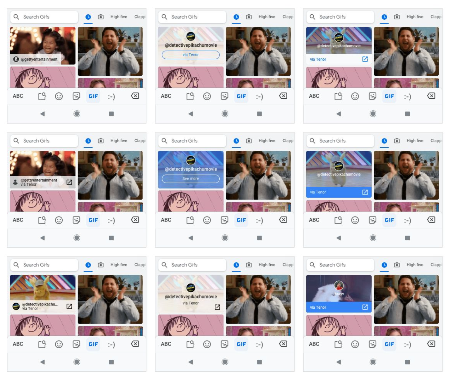
● Visual prominence
● Username display
● User Avatar
● CTA display
● Animation
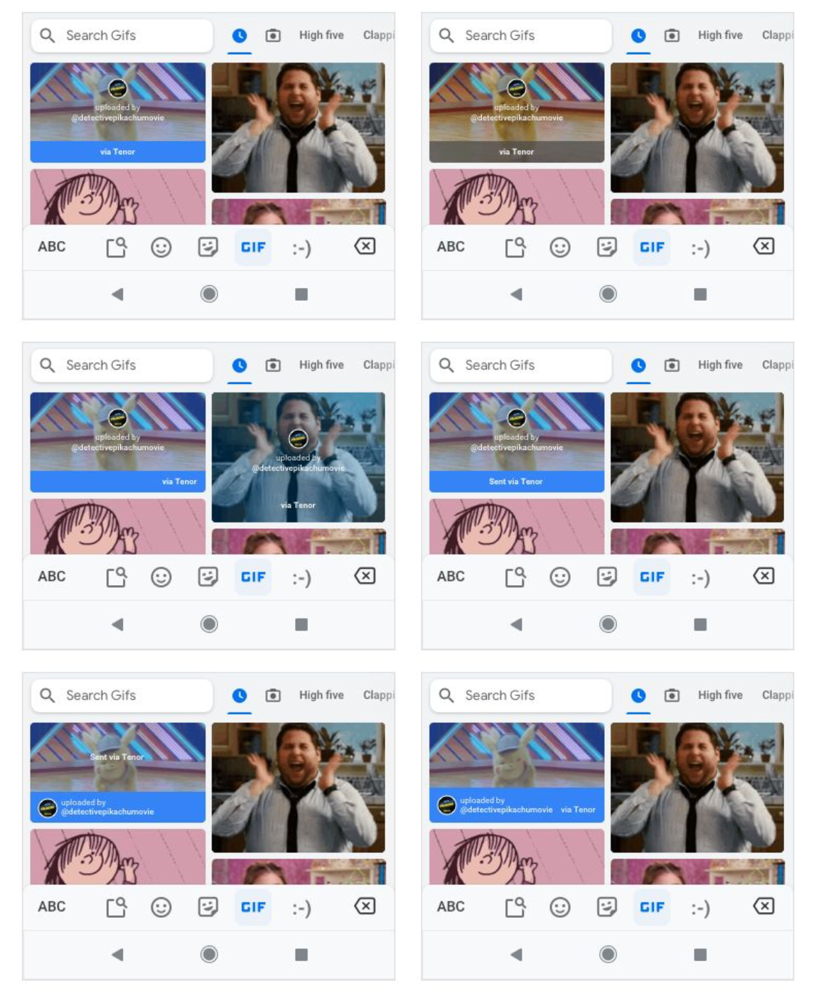
Explorations
User Testing
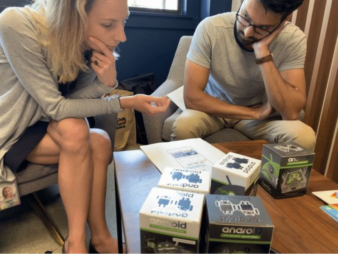
I partnered with Gboard’s UXR team to set up a cafe study to learn more about user expectations for attribution.
User study summary
To keep this study lightweight, we performed a “cafe” test, where we approach ppts and ask them to run through a brief set of tasks.
Tasks
Impressions of GIF attribution Clickthrough to uploader understanding of what they can do next.
Lightweight usability analysis
Observe for areas of confusion Observe for path and expected results of task success/failure.
Sample size
11 participants
UXR Takeaways
Visual Feedback
Users didn’t understand the attribution was from the person who uploaded the GIF. Some thought that it could have been the recipient of the GIF.
Interaction Feedback
Users didn’t understand the Tenor profile page and how it related to this flow. Users didn’t understand what the page’s purpose was.
It is not clear to users that they are looking at someone’s profile with Tenor’s current design/layout.
Attribution refinements
Based on the user study feedback, I started exploring versions that included more clear attribution.
In the coming weeks, we planned to select live experiments to run and we ended up deciding to not have a link out for feature MVP to avoid user confusion RE: our study results.
The team decided to track if users tap on the new user attribution now that they appear more actionable than before to measure user interest.
Solution
Show clear attribution for GIF content that is User Generated within Gboard’s UI.
Key learnings / Takeaways
Because of my impact, we pivoted the direction of the product leading to a better user experience in the future.
My decision to work with UXR influenced the decision of my team to revisit Tenor’s Profile page. Post-experiment I held an initial brainstorm with project stakeholders to discuss potential improvements. Profile improvements were added to the Tenor product roadmap for Q4.
Making sure that team goals were aligned initially was difficult but through the process of UXR we were able to pivot in the end
Tenor.com links are not ideal for this use-case forcing us to rethink the direction of the product feature.
Understanding the existing Gboard design framework and its limitations.
