Tenor Stickers in iMessage
A new way to express yourself
Role
Led UX design and expression search vision. Collaborated with PM and ENG partners from concept to launch.
Impact
Share rate for “Head terms” for Stickers Search is 78.19%, and the Share Rate for Head Terms for Conventional Search is 75.17%. Stickers Search is 3.97% more performant for Head Terms.
“Head terms” constitute the top 75% of terms searched on a given day. On an average day, this is about 11,000 unique terms. Problem
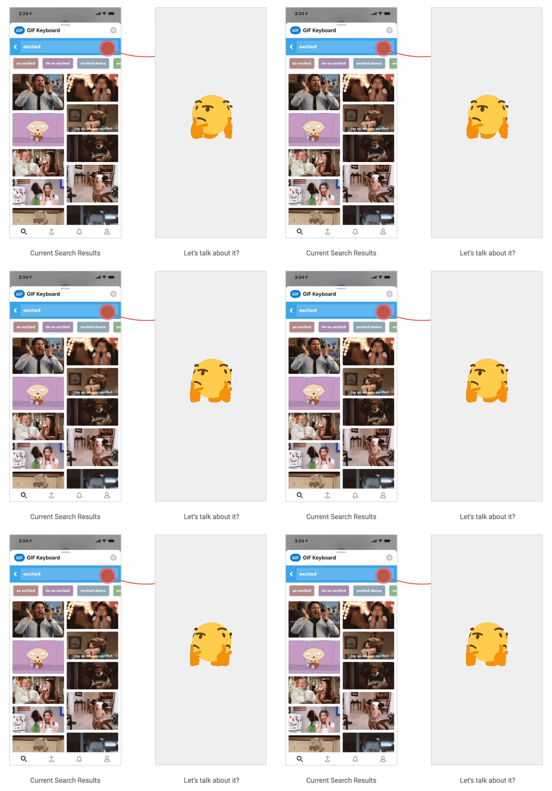
With the introduction of stickers, users can now search for multiple content types.
Solution
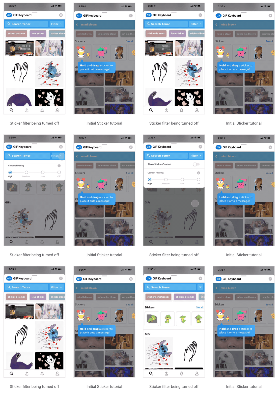
Introduced a new Sticker cluster that can toggle on or off allowing users to choose to hide Sticker content from their experience if they choose.
Why stickers?
Stickers - GIFs or static PNGs used/shared for expression that has a transparent background.
Adding an additional type of media will help Tenor’s users express themselves in more ways.
The introduction of new format types is a goal for Tenor’s 2019 product roadmap and Stickers is the first format that we are tackling at scale.
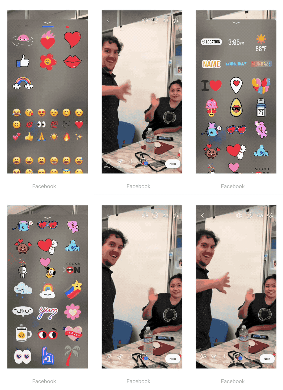
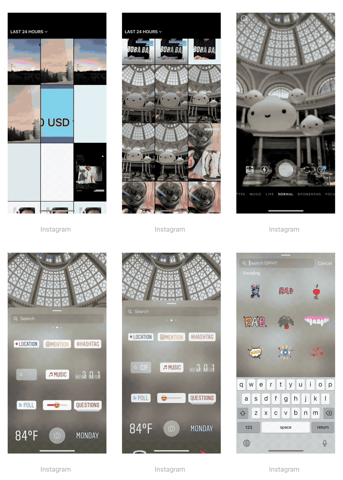
Many other social products are already offering and utilizing stickers to help their users better express themselves.
Problem
Tenor wants to diversify its content offerings beyond just GIFs
Feature Considerations-
● A new way to search
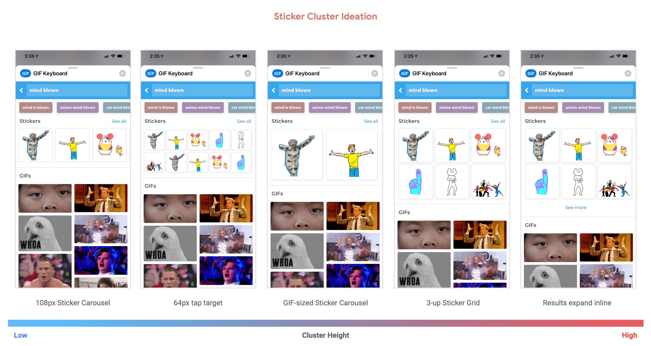
● Introduce stickers cluster
● Not alienate our current users
● User education
● Quality of results
Understanding the interaction
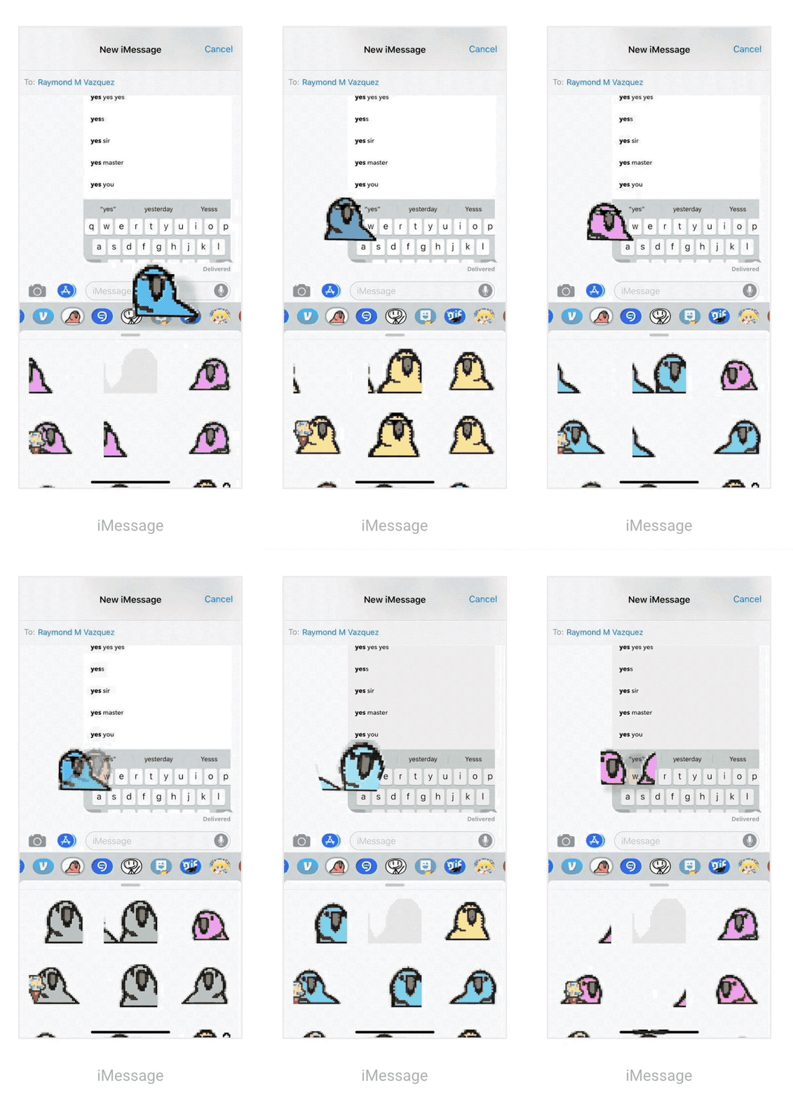
Through my research, I discovered that Sticker interaction patterns are different from GIFs.
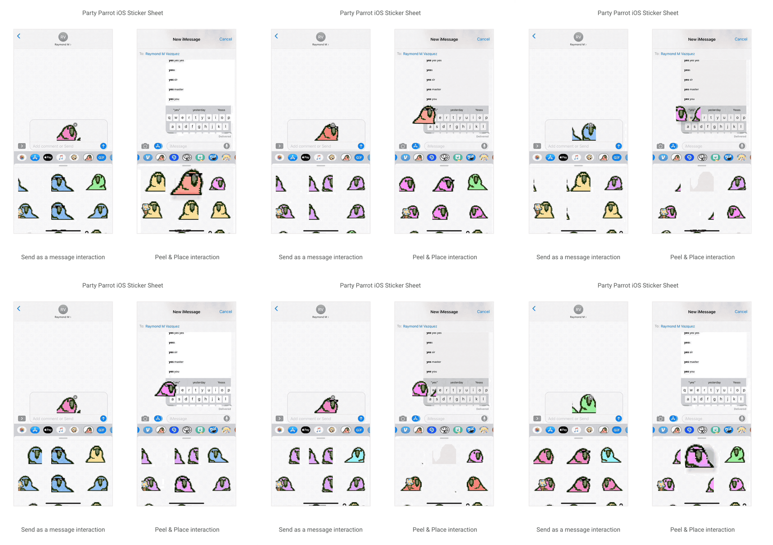
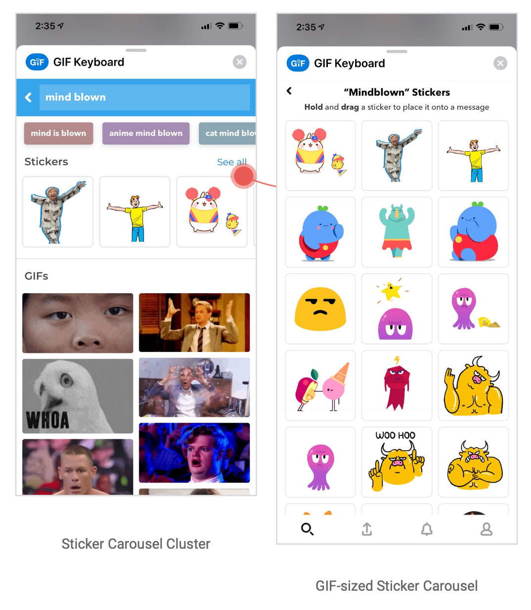
If a user taps on a Sticker, it will be inserted into the iMessage input box, ready to be sent much like how GIFs are sent. However, with Stickers users can also hold down on the stickers, which will invoke a “peeling” and “placing” interaction. The user is then able to drag the Sticker with their finger and insert it into a message.
I knew I had to come up with an experience that could support both interactions but also not detract from our GIF offering.
Potential User Flows
How might we introduce this feature in the current app experience and how will it interact with other features when users perform a search query?
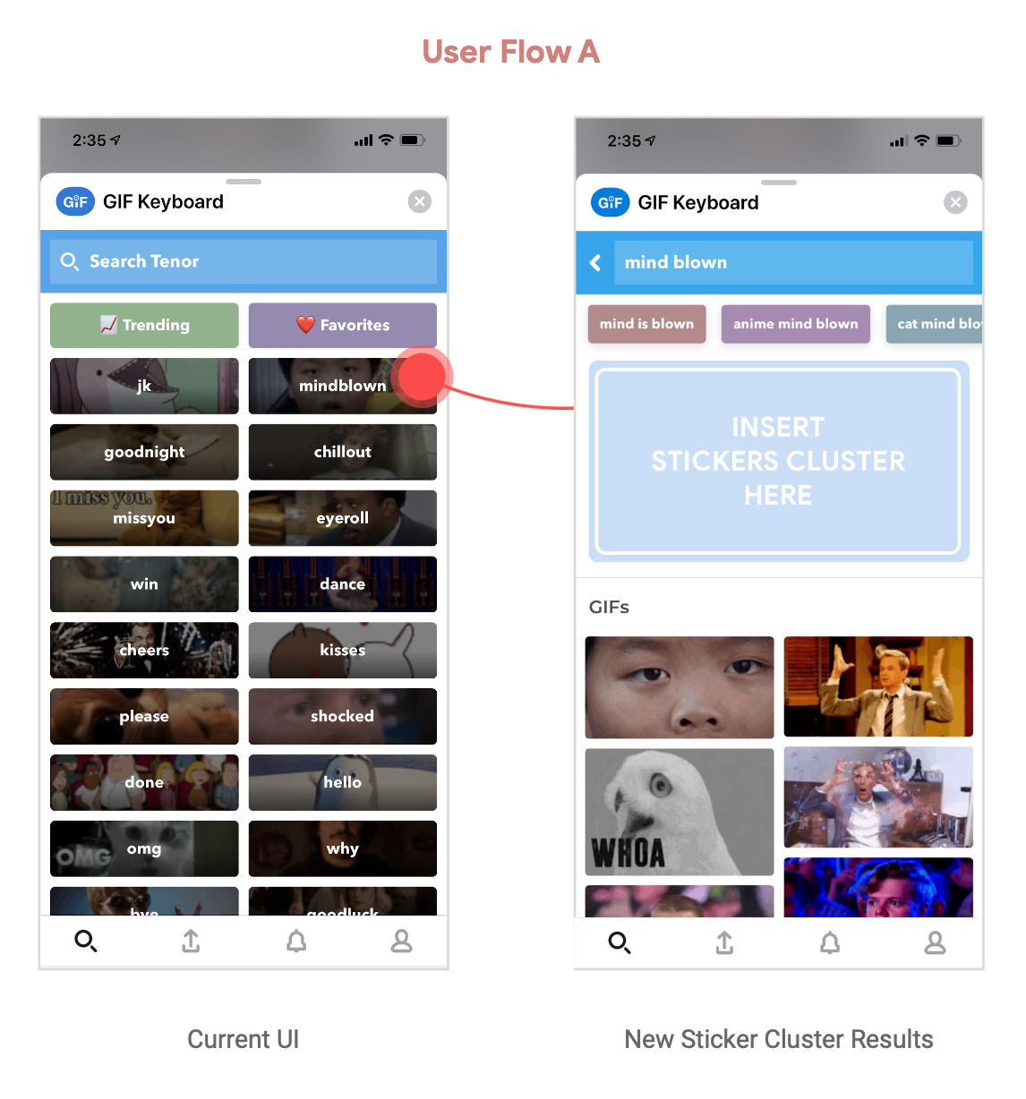
Flow A
Stickers results are shown as a new separate component after a user query.
Pros
● Seamless introduction to the new product offering
● We could measure user intent for Sticker search
Cons
● UI promotes Sticker results alongside GIF results for people who may not be looking for stickers
● Some user education is required
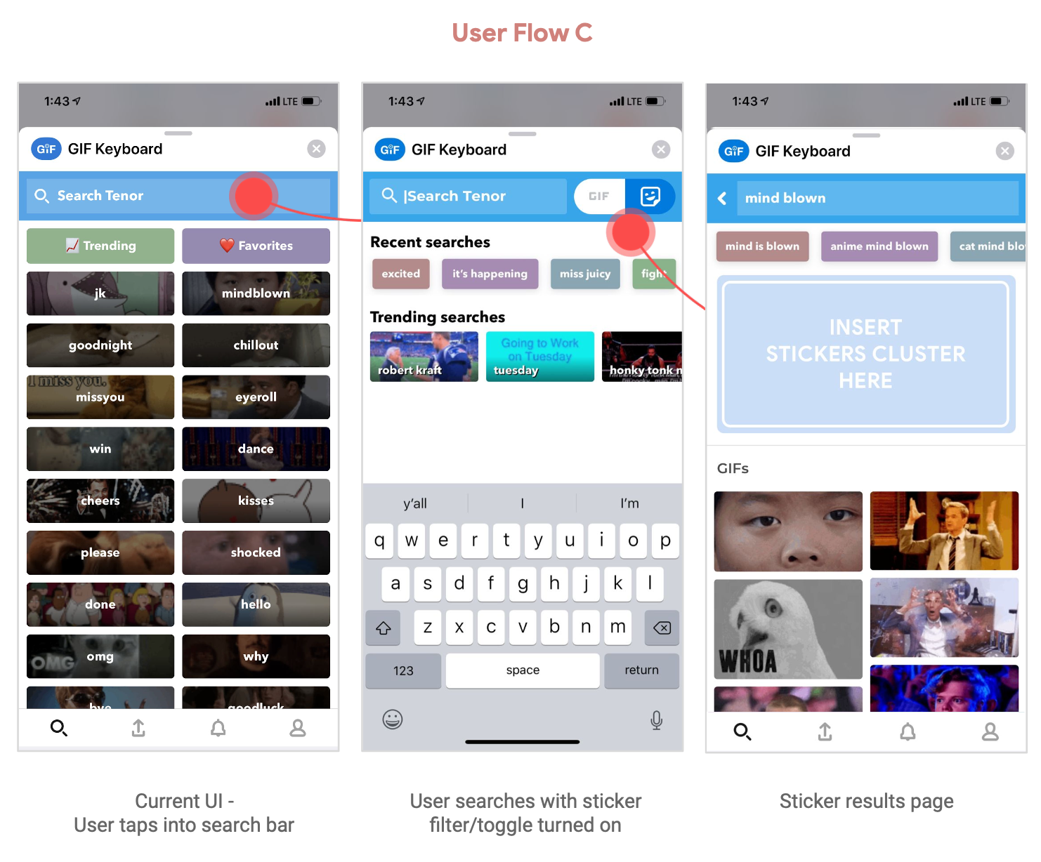
Flow C
GIF/Stickers filter after user taps on the Search Bar
Pros
● Scalable for the future content additions
● Clear measure of user intent for sticker search
● Gives user control of their own experience
Cons
● Extended Dev cycles ● Lack of discoverability
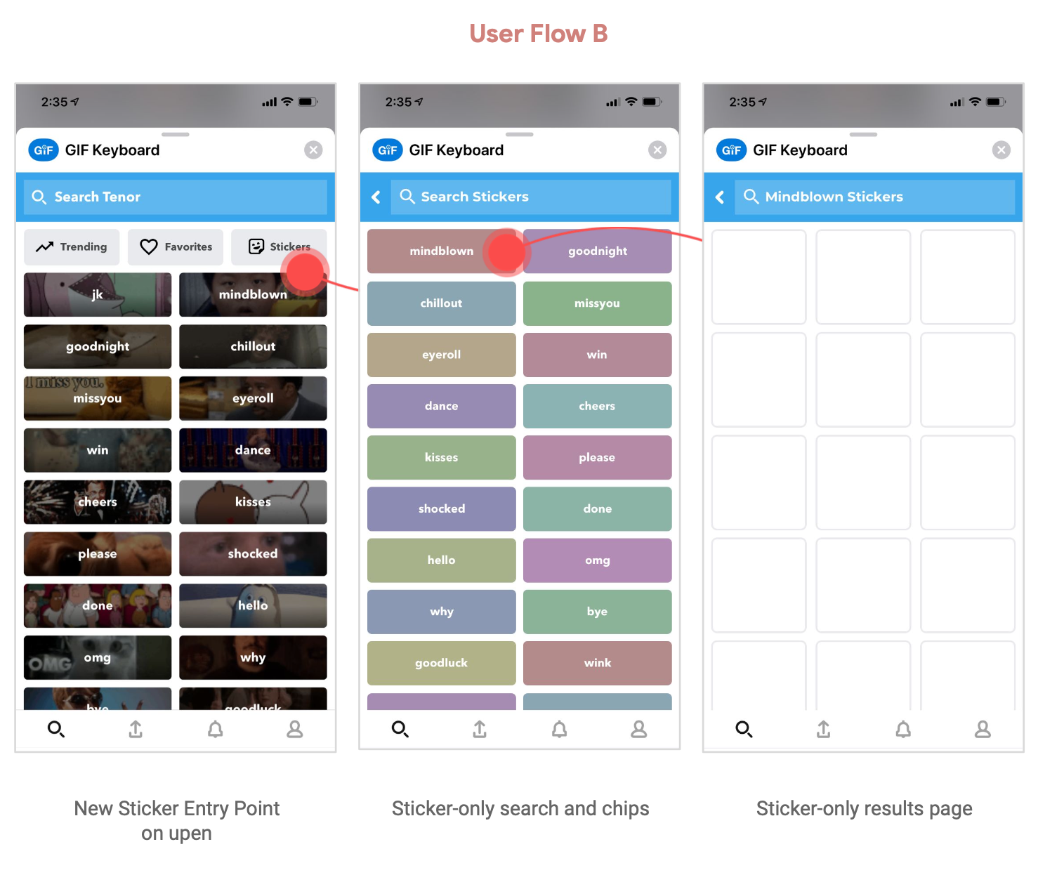
Flow B
Introduce a new sticker-only entry point before the user query
Pros
● Puts user in control of desired content results
● Clear measure of user intent for sticker search
Cons
● It takes 2 clicks to get to the Sticker endpoint
● Lack of discoverability
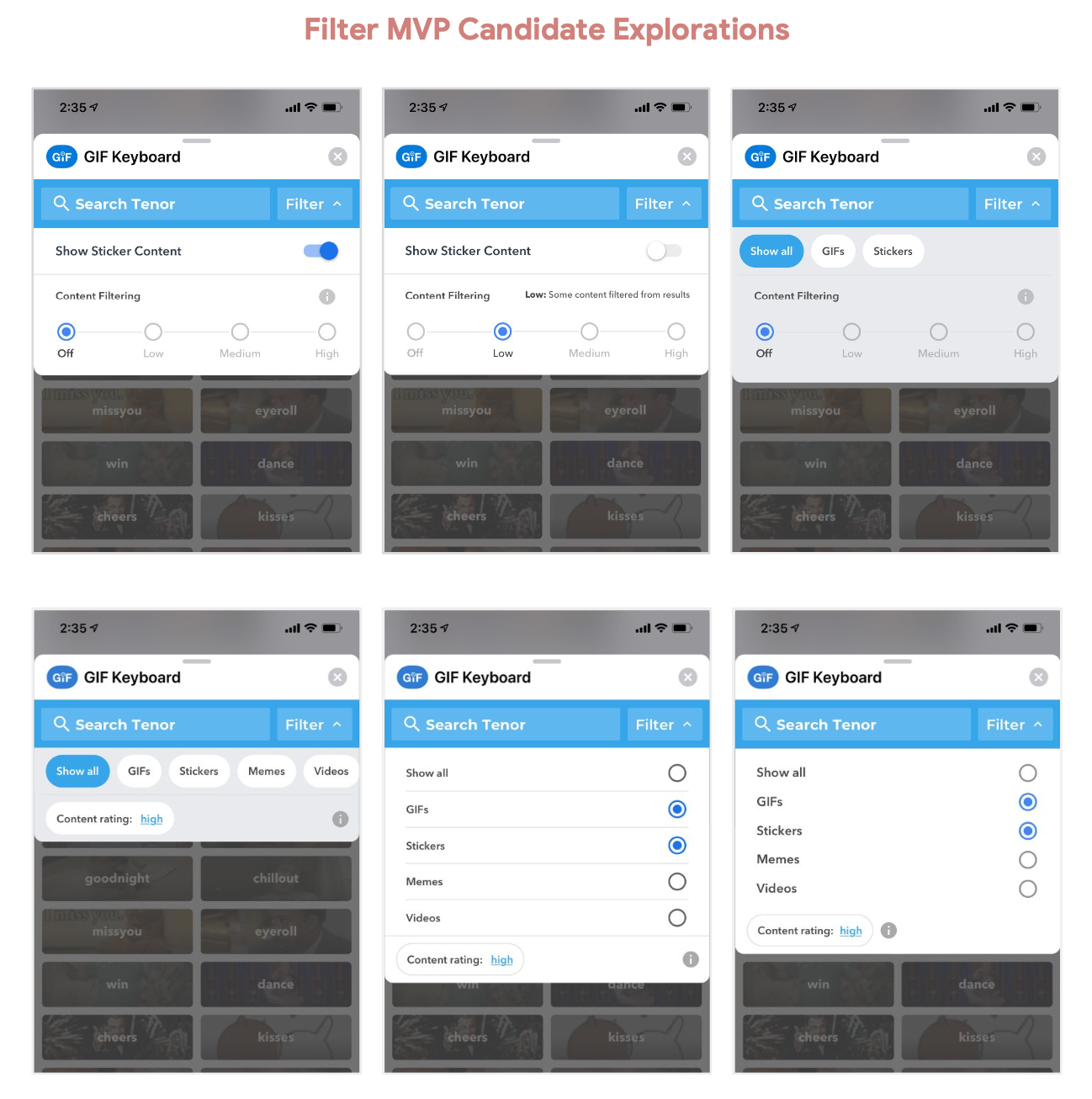
Content Filter
I explored a few different ideas for a content filter selecting and deselecting to measure scalability.
Explorations
My hypothesis was that the inclusion of stickers would slightly impact GIF(conventional) search and share rates but by giving users a little education and the ability to have control of their experience we were hoping to see few negative engagement metrics.
Live Experiment
A stickers experiment was rolled out to 10% of Tenor iOS Messaging Extension users.
In the experiment, a cluster of stickers appeared at the top of search results that users can drag and drop into messages.
The remaining 90% of users were able to manually opt-in by toggling the sticker option in the filter.
Hypothesize and Experiment
Live Experiment Results
Tail term share-rate:
The share rate for tail terms for Stickers Search is 55.12%, and the share rate for tail terms for Conventional Search is 63.69%.
Stickers Search is 13.46% lower 😓
Head term share rate:
The share rate for head terms for Stickers Search is 78.19%, and the share rate for head terms for Conventional Search is 75.17%.
Stickers Search is 3.97% more performant 🎉
Solution
I Introduced a new Sticker component on our iOS keyboard extension that can be toggled on or off allowing users to choose to hide Sticker content from their experience if they choose.
I also made it a point to add a tooltip for user education upon app update.
Pros
● Cater to mobile-friendly aspect ratios
● Great for continuously updated content
● Reveal a teaser/peek into the content
● Optimized for a small to medium set of results
Key learnings / Takeaways
I advocated for a scalable UX approach (the content filter) which will benefit Tenor’s ecosystem long-term. Eng time was longer but through working with stakeholders I was able to convince them this was the best solution for our users.
Learning from prototyping was a huge win for this project. I worked with my Dev to rapidly iterated on the tray and drawer animations which all informed the final launch.
Building a new product offering as large as this came with some supply and demand issues in its initial launch.
