YouTube Search - Deeper Metadata
Visual UI updates for Deeper Metadata to assist users in successfully evaluating and engaging with videos results
Role
Led UX design and collaborated with UXR, PM and ENG partners from concept to launch.
Impact
Improved feature Modernization Score overall and saw an increase in user usage metrics from both consumers and creators.
Problem
Users are encountering comprehension challenges or, in some cases, simply overlooking the feature altogether.
Solution
Implemented intuitive features and functionalities, aimed to empower users to make informed decisions and effortlessly explore video content.
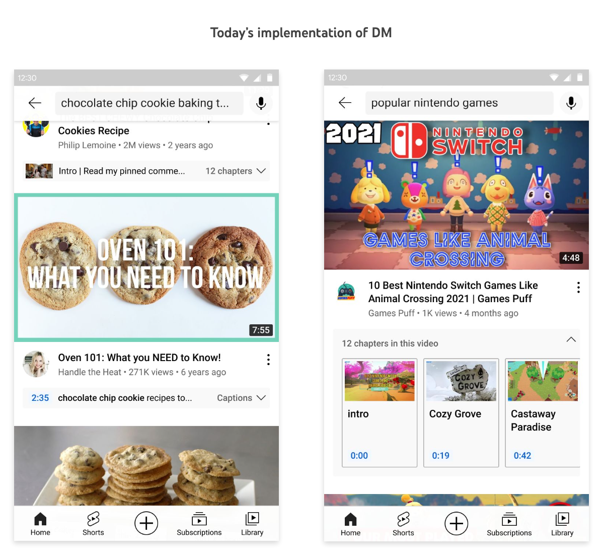
Deeper Metadata refers to additional information presented in a collapsible panel below a video.
This supplementary data is incorporated into search results to provide users with more comprehensive insights into the video's content.
By offering deeper context and details, our aim is to enhance the user experience by saving time and facilitating efficient evaluation and navigation within the video.
Extensive user research confirms the value of this feature, but its current implementation leads to comprehension challenges and users overlooking it. A comprehensive redesign focused on enhancing user comprehension and aligning with YouTube’s 2022 goals for modernization.
Why prioritize visual improvements?
Recorded UXR pain points
● Doesn’t feel “Modern”
● Feature discovery
● DM connectedness to the video
● Chapters Cards designs may invoke a feeling of unwanted ads with video (not scalable to other types)
UXR Study
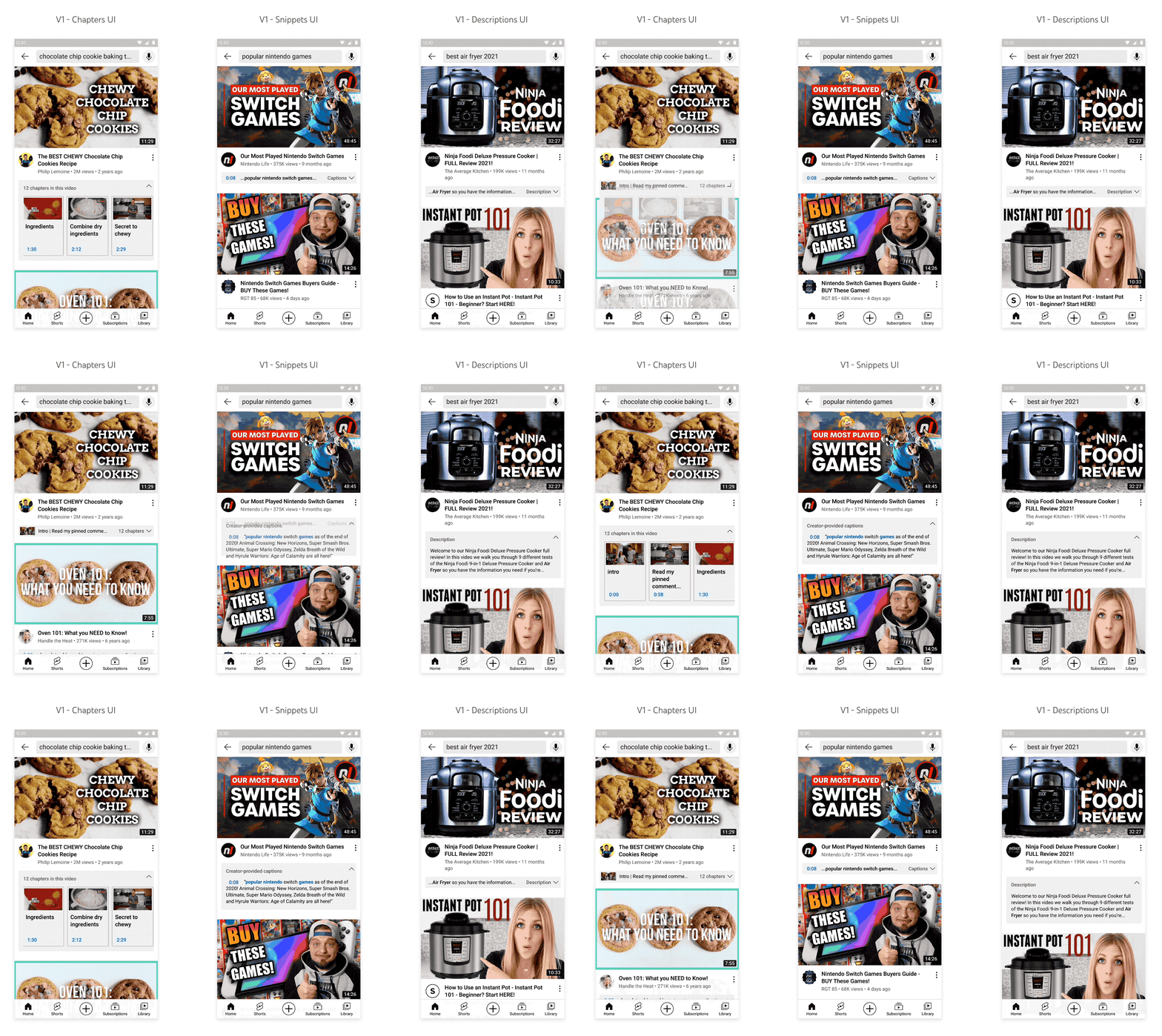
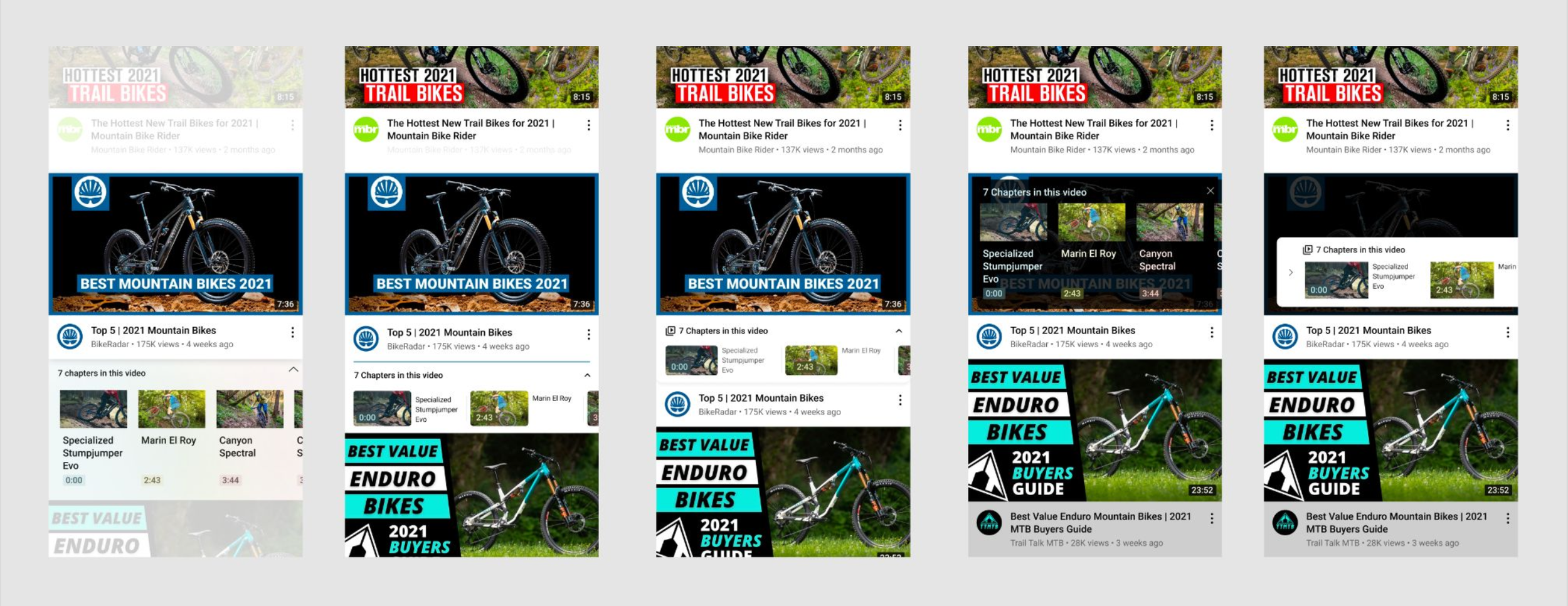
I worked with my User Experience Research (UXR) partners to create different UI variants for a study aimed at assessing user comprehension.
We aimed to enhance feature clarity with color and layout changes while hoping to not overwhelm or overshadow the VODs or other content in the feed that users could find important.
UXR Findings
The user study concluded that my most expressive and visual design approach (C) significantly enhanced the feature.
Our group of participants consistently highlighted the modern feel of this approach, emphasizing improved visual clarity and seamless integration with the video content.
Explorations
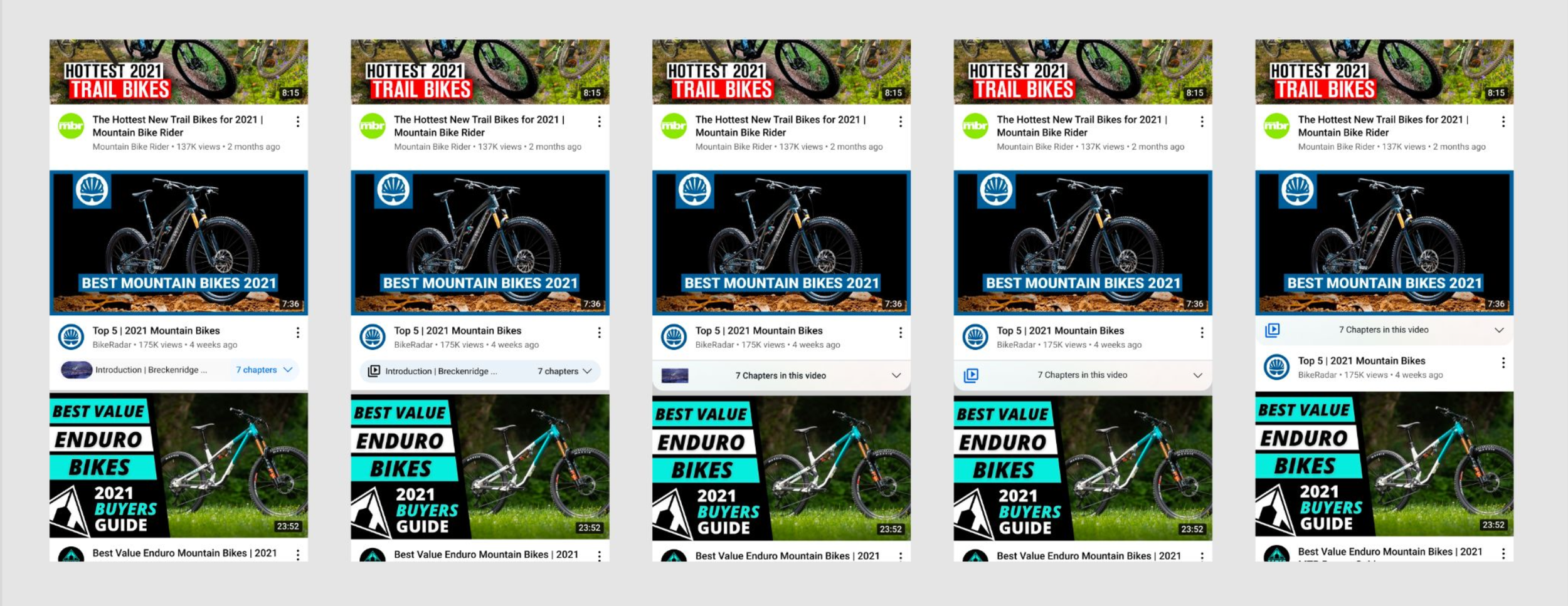
Taking into account the valuable feedback from UXR, I proceeded to delve into the exploration of several variations in terms of color sampling, visual prominence, and thumbnail size.
By experimenting with these elements, I aimed to refine the user experience and find the optimal combination that strikes a balance between aesthetics and usability.
Solution
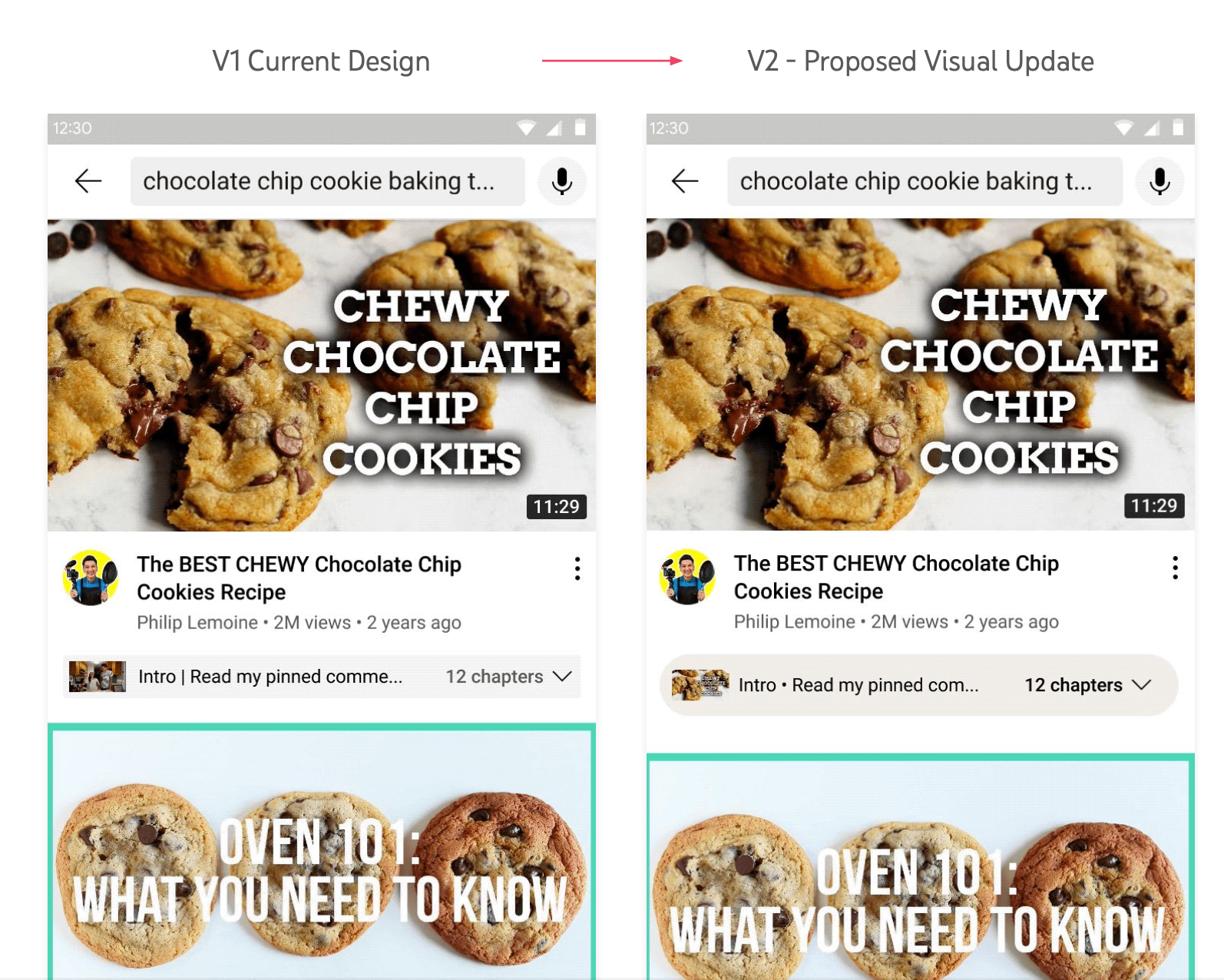
Before → After
Introduction of a modern, color-sampled pill-shaped entry point to the DM panel to improve feature discoverability and connection with the video’s thumbnail
● Larger DM entry point
● Pill Shaped
● Color sampling (panel background & timestamp)
● Bold Expanded headers Not included in V2
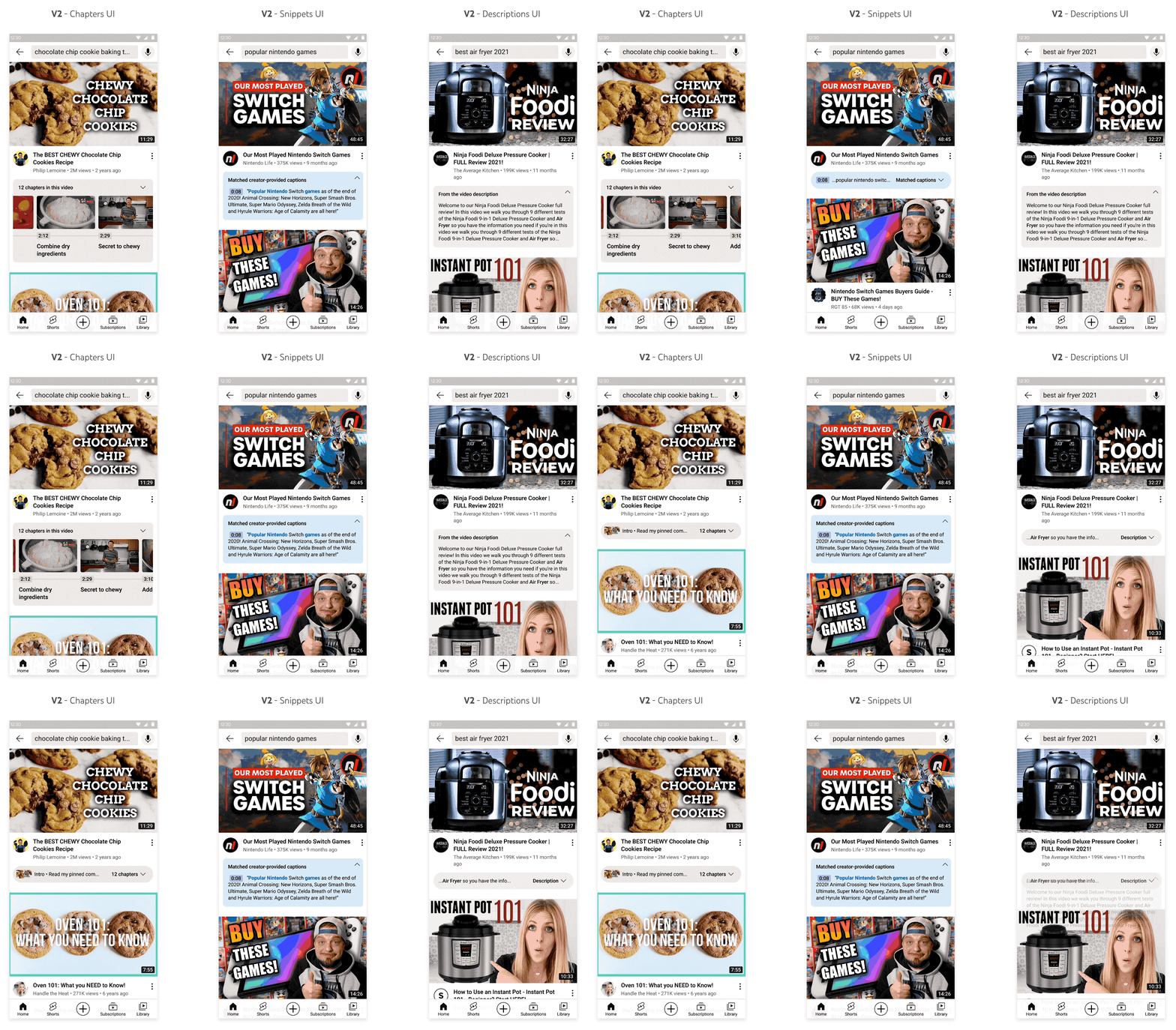
Chapters in this video
● Rounded Corner added to chapter Thumbnails
● Test video thumbnail vs Chapter thumbnail while collapsed
Moments in this video
● Remove timeline UI for Key Moments
● Test video thumbnail vs Key Moment thumbnail while collapsed
Snippets → Matched Captions
● Renamed “Matched captions”
● Color sampling for timestamp
● Add clarity to the expanded header (Matched creator-provided captions)
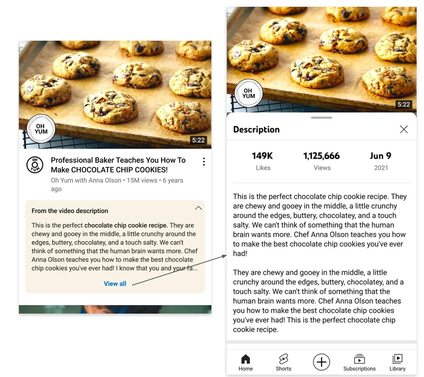
From the Video description
● Additional word count added to the expanded state
● Clarifying text to the expanded state (from the video description)
Future innovations
Following the successful launch of the visual improvements, I directed my attention towards further enhancing this feature in various ways. I generated a range of potential ideas aimed at improving its functionality and user experience.
By exploring these proposals, I sought to continue the iterative development process and deliver even more valuable enhancements to the feature.
Multi-Types UI
Future explorations where multiple types of metadata are represented in a single panel.
New DM types to consider -
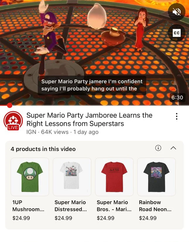
● Products / Shopping
● Locations / Maps
● Learning / Education series
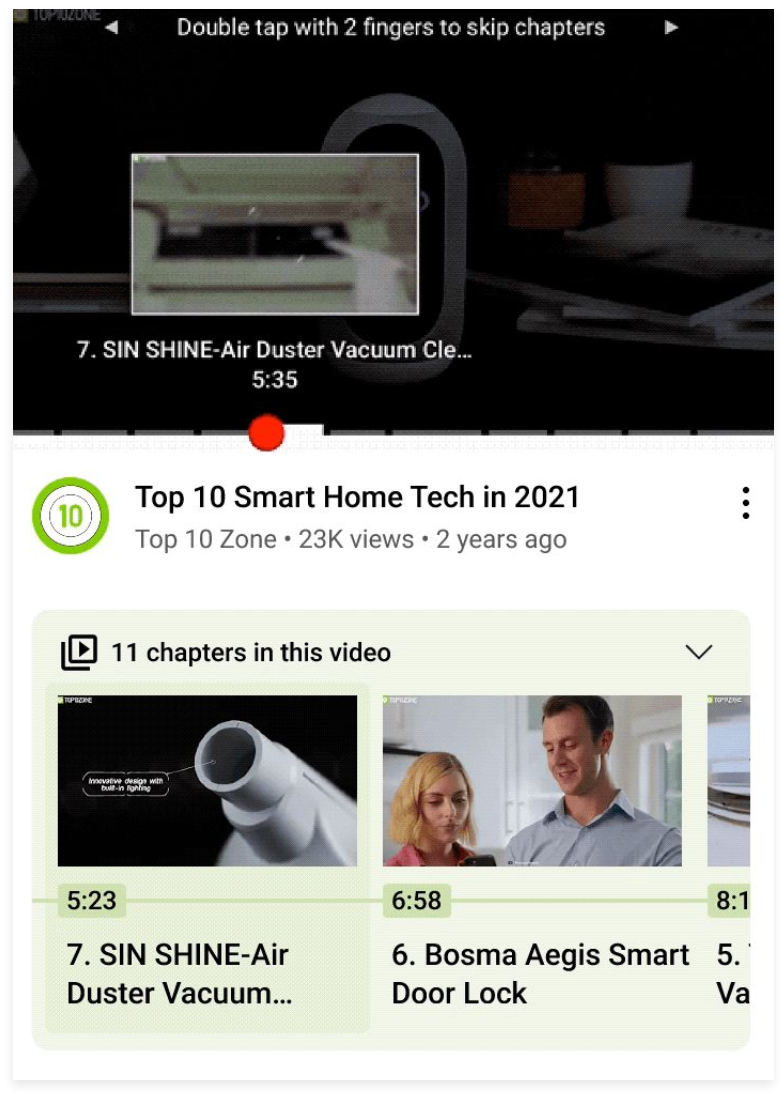
Scrubbing with Chapters/Moments
Future explorations where we sync Chapters with Scrubbing. Having both could help users with the evaluation.
Considerations -
● Bring in chapter UI to scrubbing
● Highlighted state
● Showing the chapter name while scrubbing
● Videos with 20+ Chapters
Navigate to Structured Description
Add “View all” link DM Description on Watch Page Structured Description
Multiple Captions UI
UXR uncovered an opportunity to show multiple snippets to give users more direct caption matches
Key learnings / Takeaways
Modernization and innovation are what users are looking for from YouTube in 2022 and beyond. This was mentioned several times during UXR.
Partnering with other teams to implement this feature to better integrate useful user features such as shopping or learning made this feature a no-brainer when it came time to prioritize OKRs
Search latency increased for this feature so we had to design around that consideration for MVP
Q3 2024 Update
A patent has been filed and approved in May 2024 for this feature under mine and my PM’s name. New features have been launched.
Shopping “products” in DM
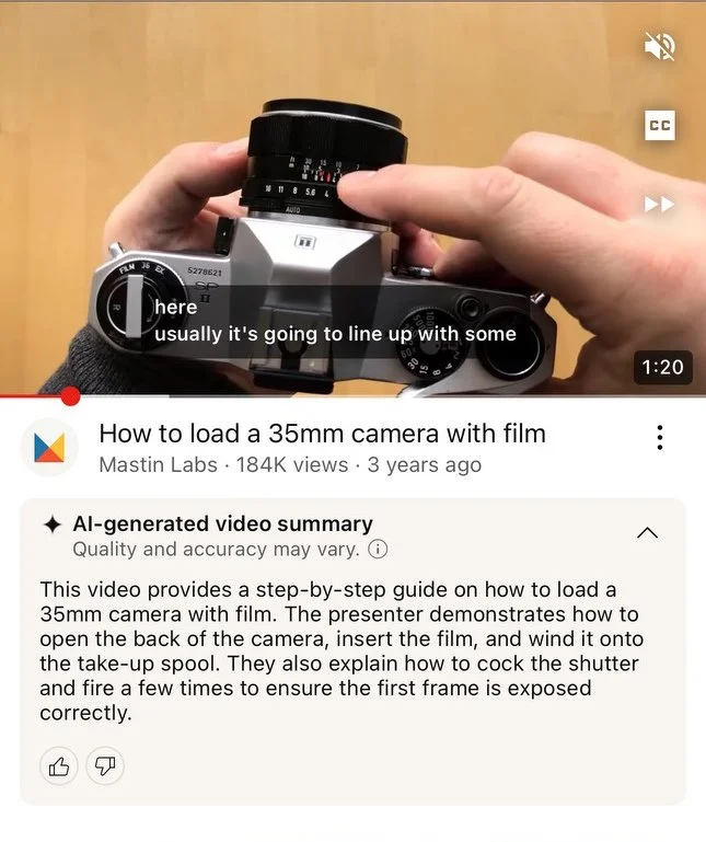
Ai-Generated summary
